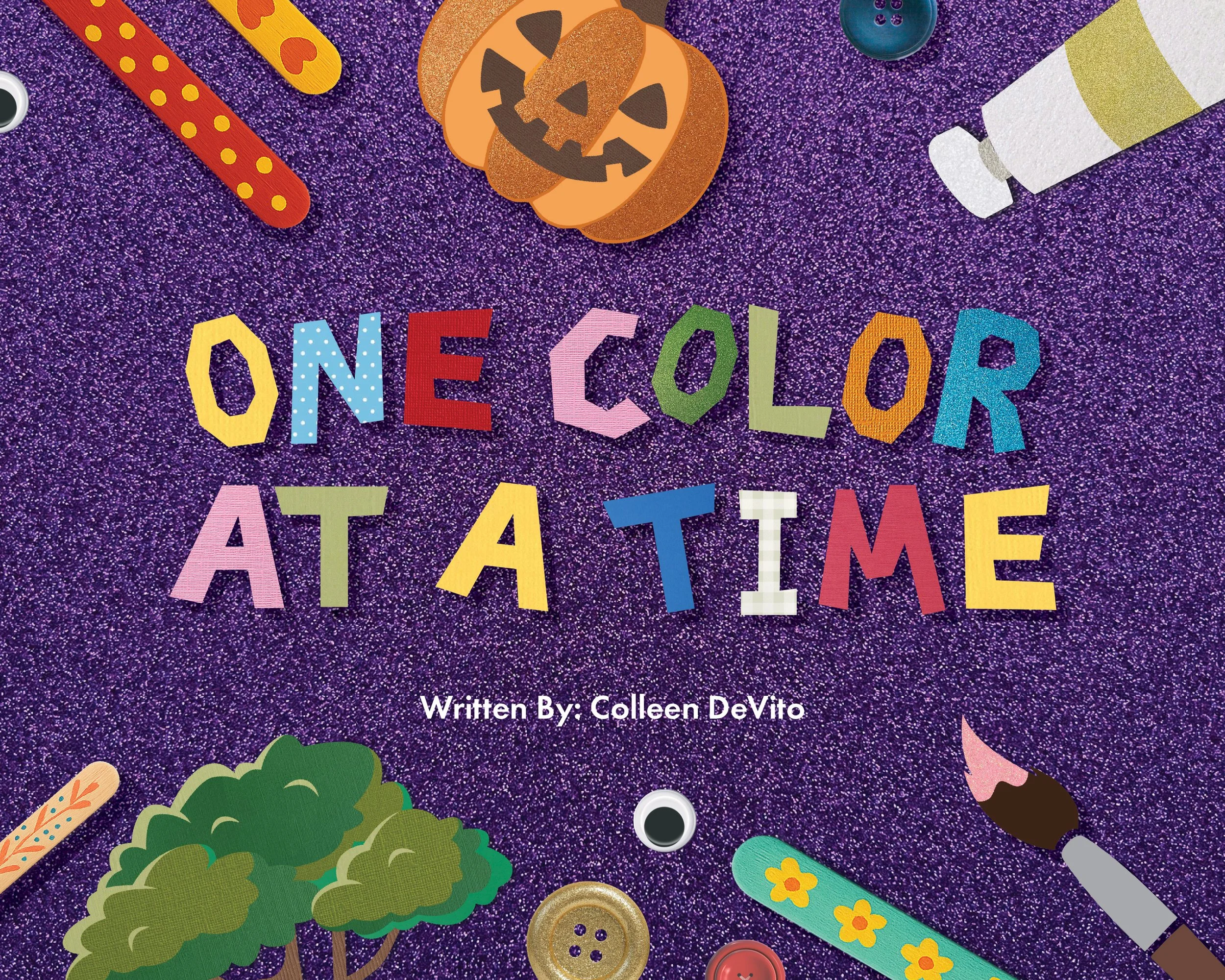
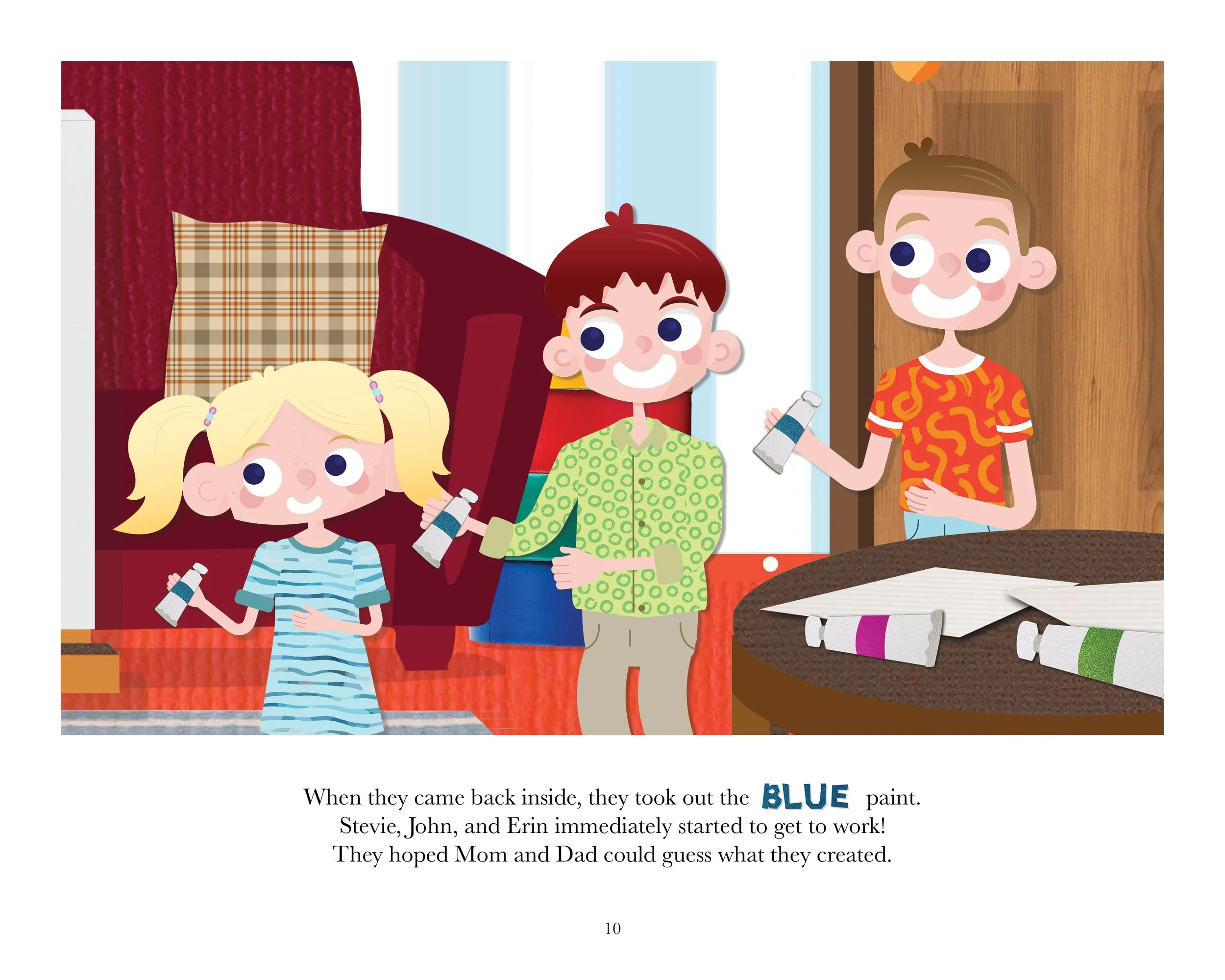
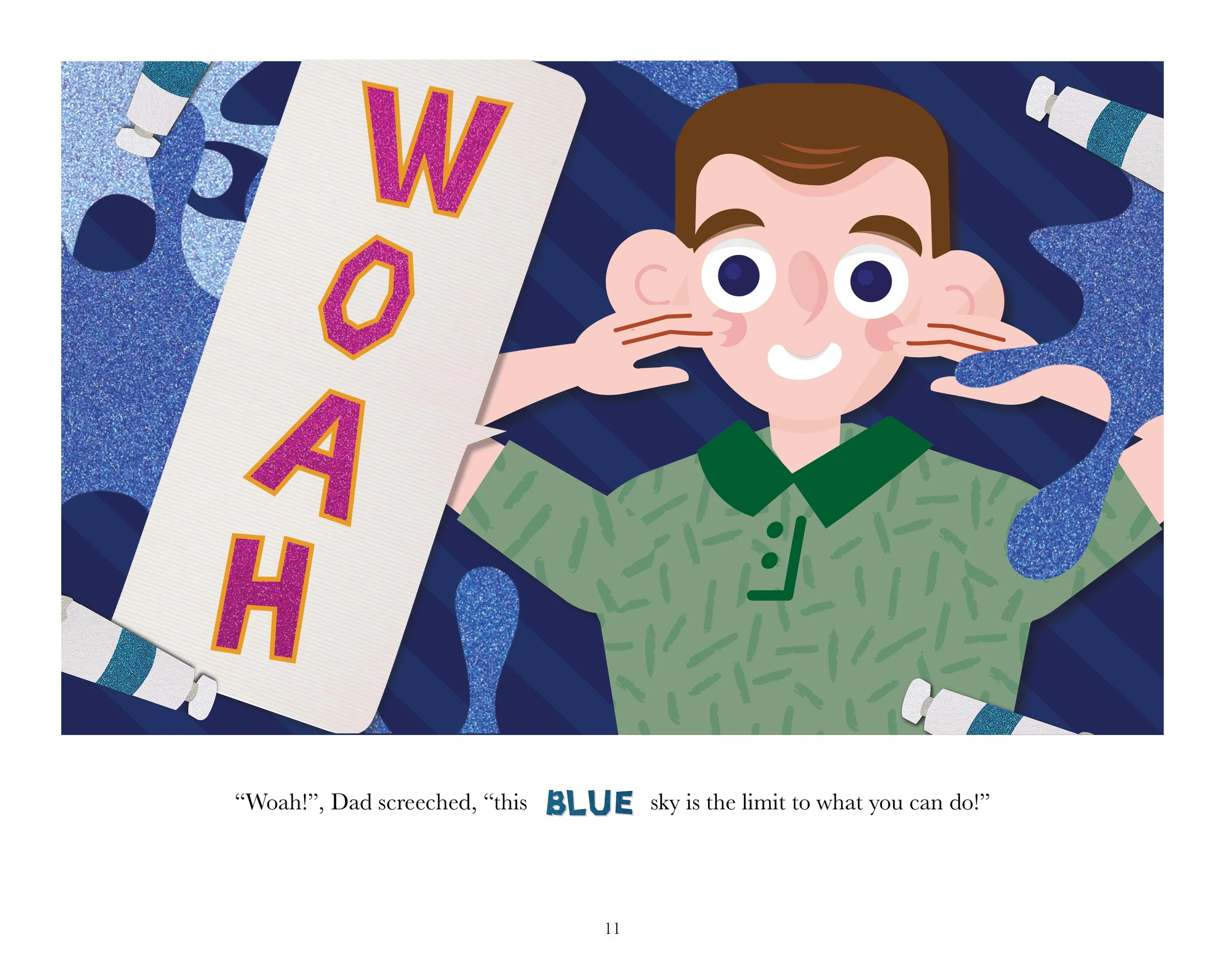
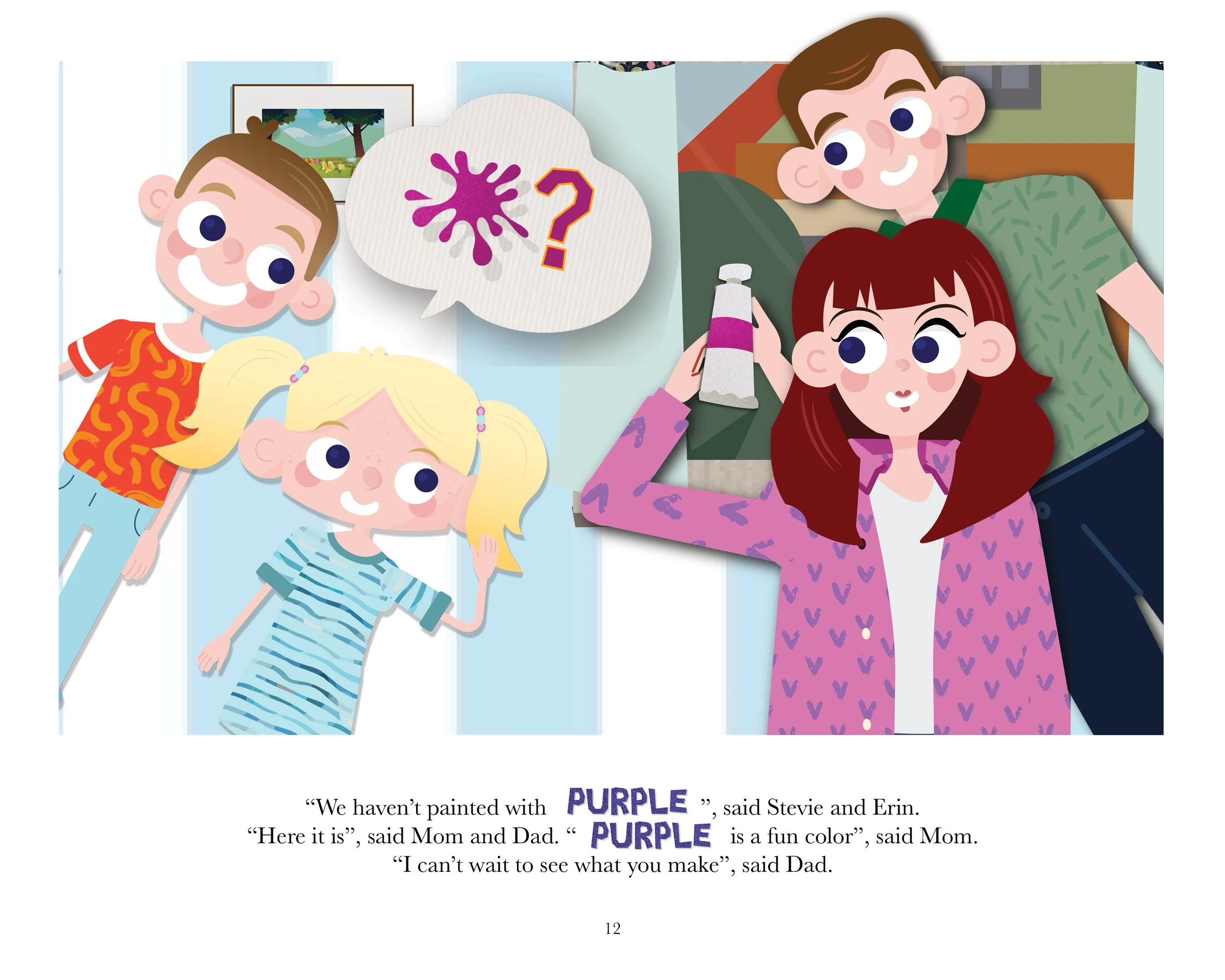
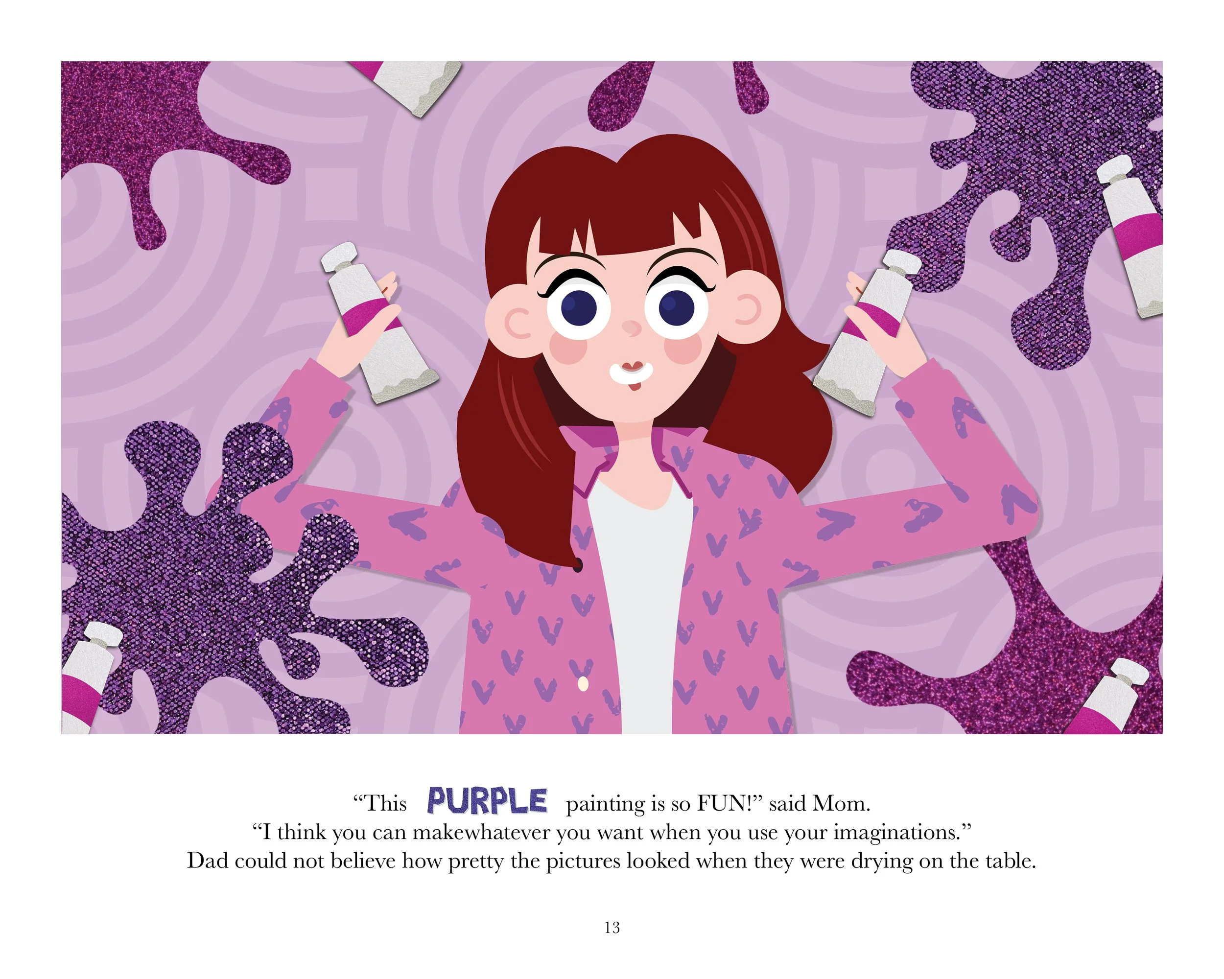
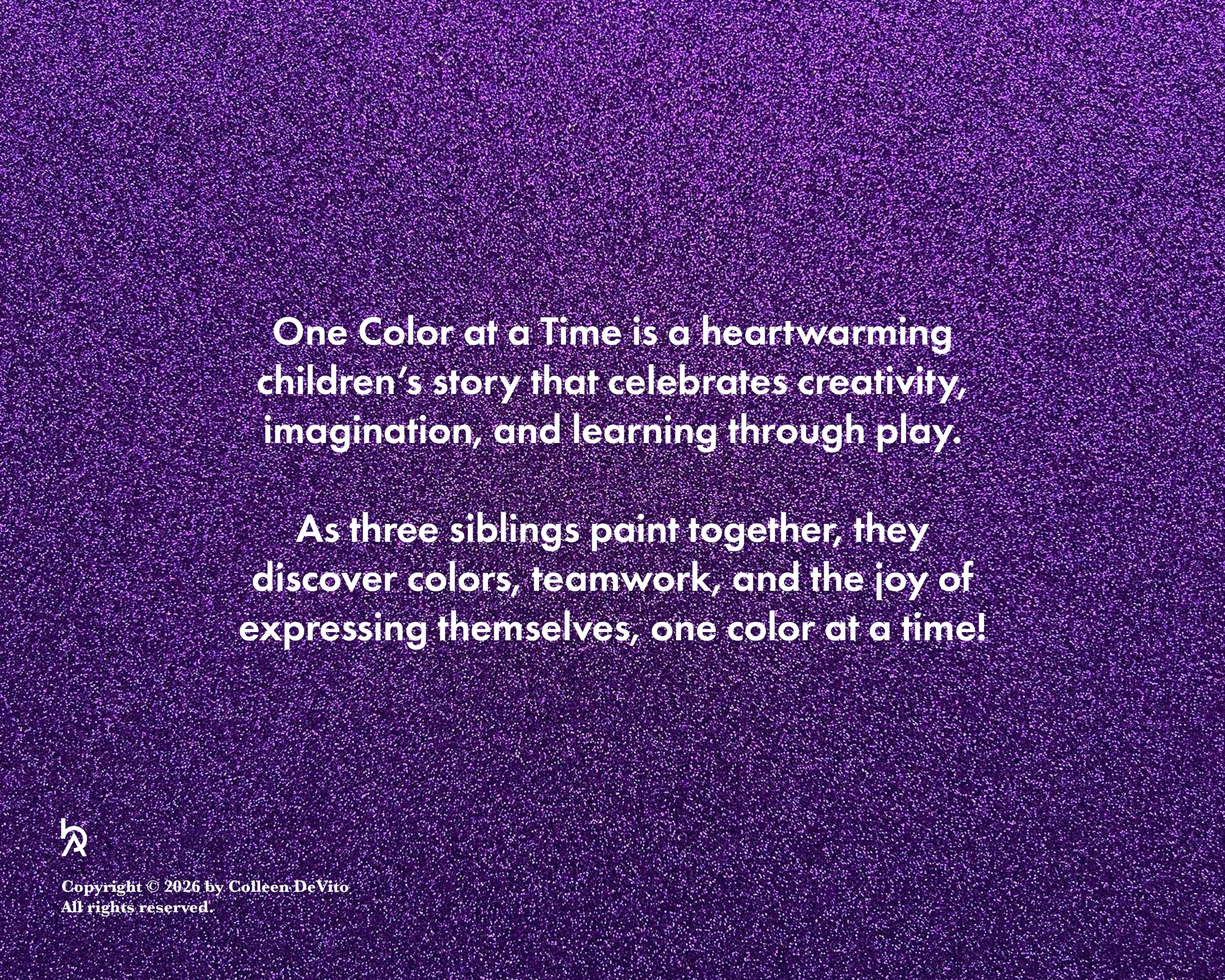
One Color At A Time
Developing a Color-Centered Learning Experience
-
CHALLENGE
One Color at a Time was developed for a children’s author seeking to create an engaging, visually immersive story centered on color and curiosity. While the manuscript was complete, the visual world of the book remained undefined. The challenge was not simply to illustrate the narrative, but to build an aesthetic language that would enhance the educational purpose of the story while remaining playful, tactile, and emotionally inviting for young readers.
Children’s books often lean into polished digital illustration or overly simplified graphics. The opportunity here was to create something more textured and experiential, a visual environment that felt handmade, exploratory, and rooted in the same curiosity the story aimed to teach.
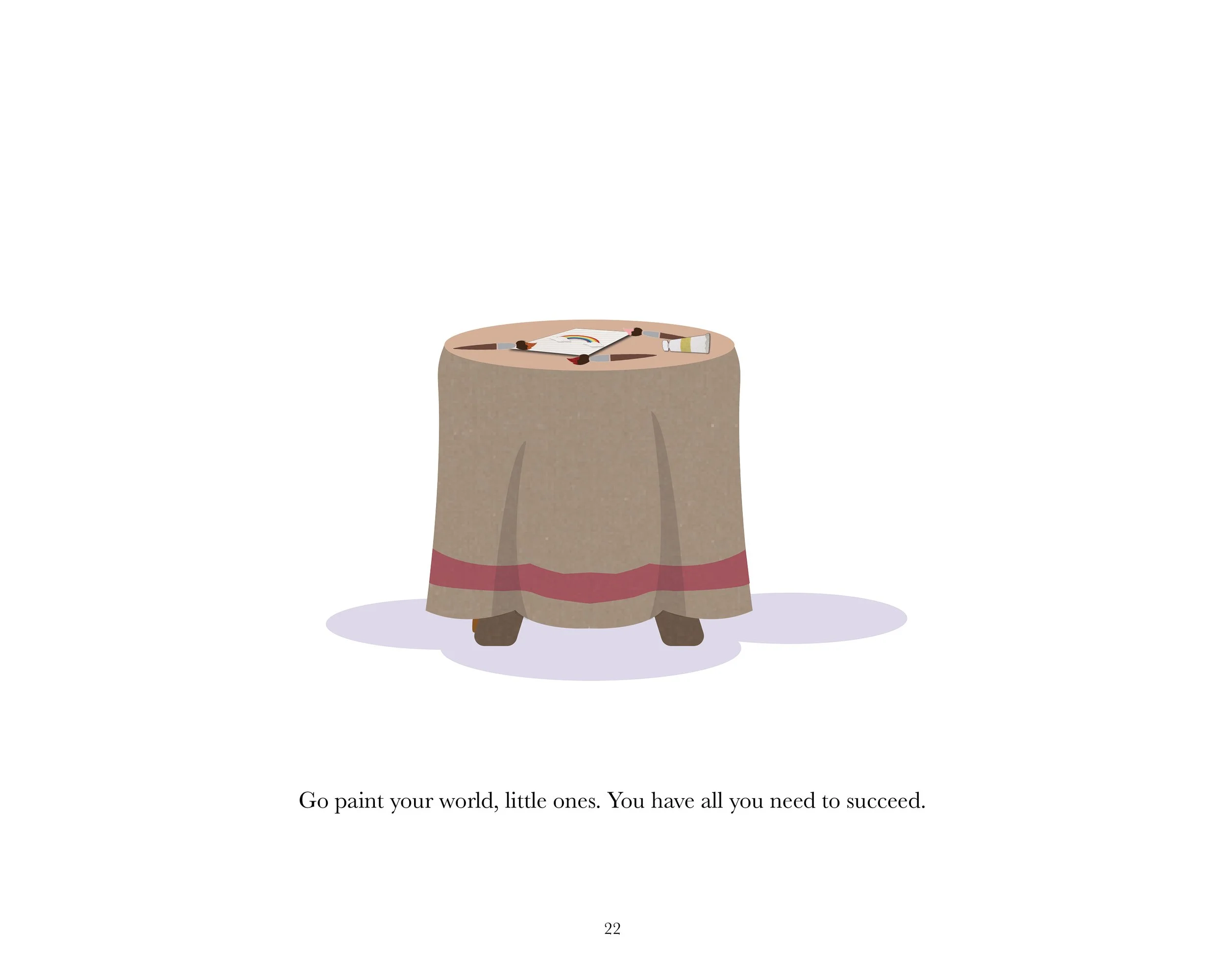
The goal was to design a book that didn’t just explain color, but embodied it.
STRATEGY
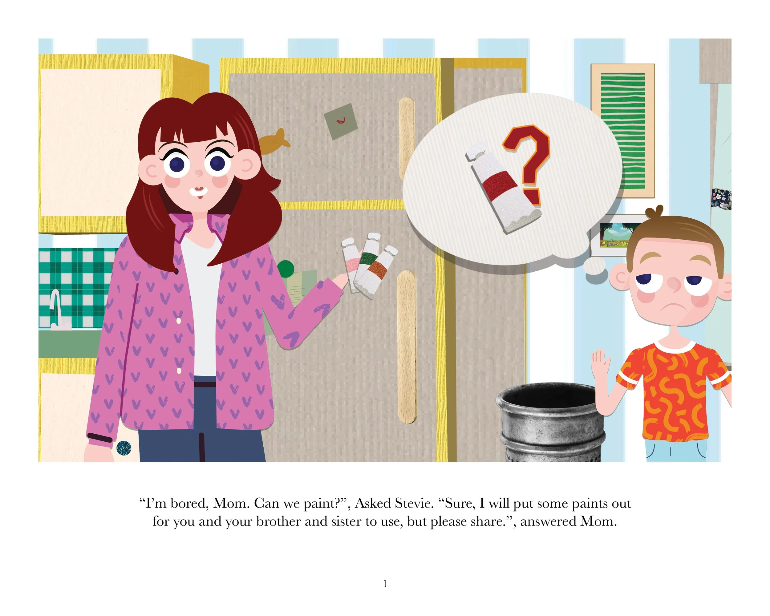
Given full creative freedom over visual direction, the strategy focused on tactility and discovery. Rather than relying on flat digital color blocks, the design would physically represent color through layered texture and materiality.
Influenced by scrapbooking and collage traditions, the approach centered on sourcing real materials. Over 50 sheets of scrapbook paper were scanned, cataloged, and digitally arranged to build a chromatic library. Each page composition was treated as a handcrafted arrangement, reinforcing the theme of exploration and curiosity through visible texture and imperfection. Typography played a crucial role in maintaining cohesion. A deliberately choppy, slightly irregular typeface was selected and refined to echo the cut-paper aesthetic, ensuring that the written word felt integrated into the visual environment rather than placed on top of it.
The strategy prioritized authenticity over polish, and curiosity over perfection.
CREATIVE SOLUTION
The final book became a fully realized tactile experience. Scanned scrapbook textures formed the foundation of each spread, layered and composed to create depth while maintaining clarity for young readers. The color palette evolves naturally throughout the narrative, allowing each hue to feel discovered rather than presented. The hand-cut inspired typography reinforces the collage aesthetic, creating a cohesive system where illustration, color, and type operate as a unified visual language. Each spread balances vibrancy with breathing room, ensuring legibility while preserving visual energy.
By merging analog textures with digital composition, the book achieves a distinctive handcrafted identity while remaining production-ready for publication. The result is a children’s book that feels personal, exploratory, and visually rich, inviting readers to engage with color not just as a concept, but as an experience.
IMPACT
One Color at a Time translates educational content into an immersive visual journey. The tactile aesthetic encourages young readers to look closely, explore textures, and develop a deeper appreciation for color beyond surface recognition. For the author, the project provided a distinctive visual identity that sets the book apart within a crowded children’s publishing landscape. For readers, it creates a learning experience grounded in curiosity, creativity, and sensory engagement. More than a story about color, the book becomes an invitation to see the world with greater attention and imagination.