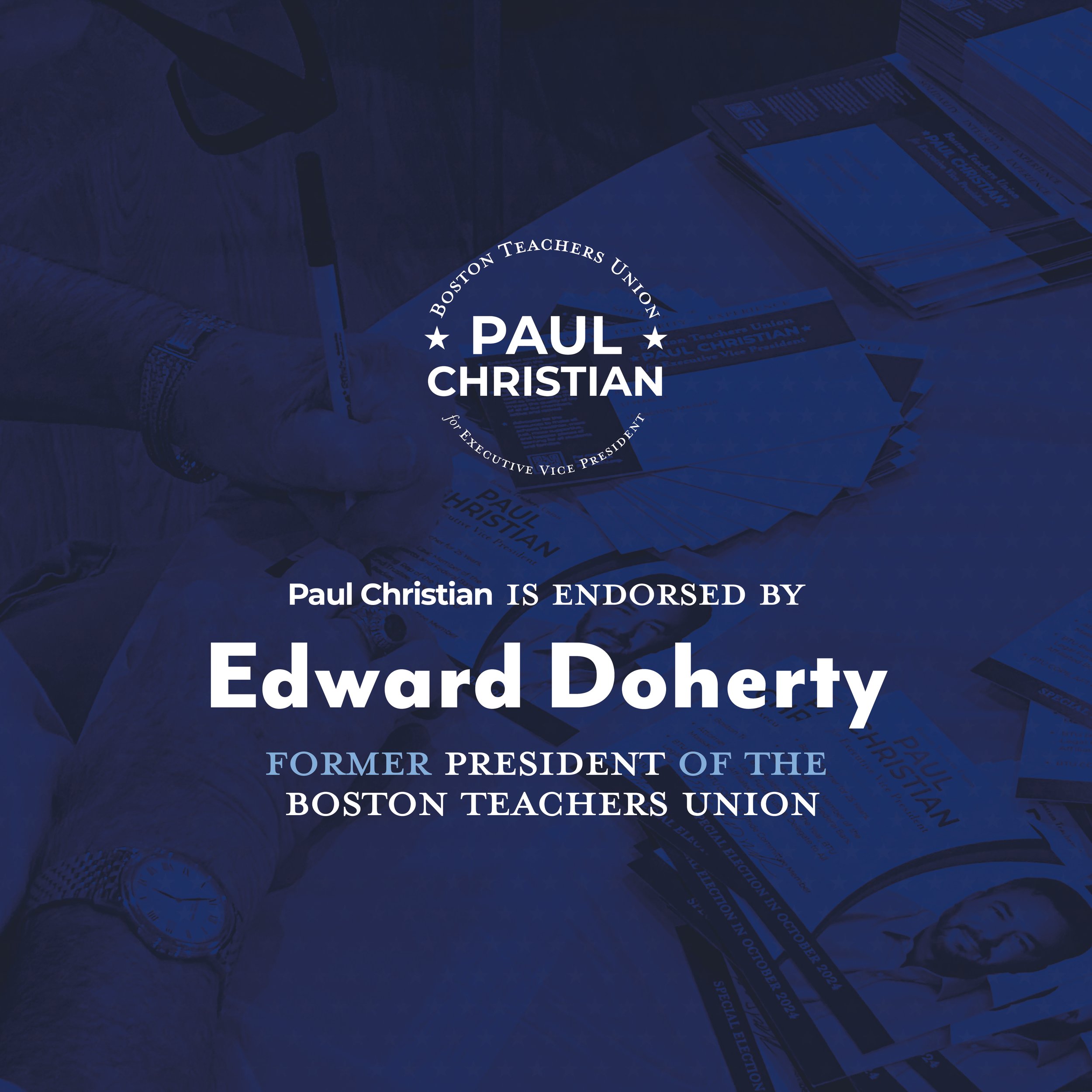
PAUL 4 BTU
From Public Servant to Public Candidate: Shaping a Campaign Rooted in Trust
-
CHALLENGE
Running for Executive Vice President of the Boston Teachers Union required more than name recognition, it required trust, clarity, and a sense of steady leadership. Although Paul entered the race with over 25 years of experience as an educator and a professional background in law, translating that credibility into a cohesive campaign identity presented a unique challenge. Union elections often rely on predictable political aesthetics, heavy patriotic motifs, assertive messaging, and traditional campaign typography. While familiar, these conventions can blur together visually and dilute personal connection. The objective was to create a campaign identity that communicated professionalism, honesty, and proactive leadership while reflecting Paul’s deeply rooted reputation as a teacher, advocate, and community figure.
This wasn’t about spectacle. It was about authenticity, stability, and reinforcing the trust he had built over decades in education.
STRATEGY
The strategy centered on credibility. Rather than positioning Paul as a disruptive outsider, the campaign emphasized continuity, integrity, and thoughtful leadership, qualities aligned with his experience as both educator and attorney.
Visual language was intentionally restrained yet confident, balancing progressive energy with institutional stability. Messaging focused on honesty, transparency, and proactive advocacy for Boston teachers, reinforcing the idea that
Paul was not simply campaigning, but continuing a lifetime of service. Consistency across platforms became key. Whether on social media, printed materials, or campaign communications, the identity needed to feel unified, professional, and easily recognizable within the union community.
CREATIVE SOLUTION
The final identity system centered on a refined monogram-style “P” mark paired with a structured blue palette that conveyed professionalism, calm authority, and institutional trust. Subtle civic references, including star motifs and clean geometric framing, allowed the brand to feel appropriate for a leadership campaign without leaning into overt political cliché. Typography was selected for clarity and legibility across both digital and print environments, supporting everything from social media graphics to campaign signage and internal communications. The visual system prioritized consistency and flexibility, ensuring the campaign could maintain a strong presence across multiple touch points while keeping Paul’s message front and center. The result was an identity that felt modern, credible, and grounded, confident without being performative!
IMPACT
The campaign identity established a cohesive, recognizable presence throughout the Boston Teachers Union community. By aligning visual design with Paul’s longstanding reputation for honesty, advocacy, and professionalism, the brand reinforced voter confidence while maintaining an approachable, authentic tone. More than a political campaign aesthetic, the identity functioned as an extension of Paul’s professional story, as an educator, attorney, and committed advocate for teachers. It demonstrated how thoughtful design can translate personal credibility into public recognition, helping a candidate communicate trust before a single conversation even begins.